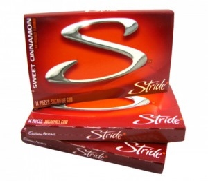
In the world of startups appearing up out of nowhere, trying to grab your money at every turn there’s a technique that seems to be used by startups in order to try and claim legitimacy. Logos exist to help build trust and familiarity with you as a possible customer, and when you see a logo that is familiar, you’re more open to giving it a chance, even if that logo isn’t 100% identical to one you’ve seen in the past, just similar curves, colors, or textures is enough to attempt to trick your mind into believing that you can trust the brand.
Enter the startup Stride Health

Normally we hate posting about these insurance startups, because they exist as a middle man, they make all their money by selling your data to other companies in exchange for a pretty sizable cut. In their world, you’re worth $20+ as a customer, per click, per information, so whatever they can get you to do in order to build trust, works in their favor.
Which is why, we believe this logo looks quite similar to Cadbury’s (Mondelēz International), Stride Gum. Take an already existing brand, build a similar logo, and gain that awesome brand trust.


